Our Art Historian at Lander always organizes a museum trip at the start of each semester. Last Saturday he and I met a group of students at The Columbia Museum of Art in Columbia, SC. It was a fun little day trip with great art and fun people. Here's how I saw it:
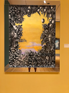
Museum and gallery visits are always interesting to me because they remind me of the continuing conversations we must have about art. As an artist and a professor, I'm supposed to have these questions nailed down, but if I'm honest, the questions of "is that art?", "why is that art?" and "is that good art?" are not always so easy to answer. The image above is a wall hanging work of art (forgive me for not remembering the artist or title) and it was one of the first things I saw in the museum. It immediately reminded me of these questions. I like it. Which is not something I allow my students to say. But I do. But is it effective? I was already smiling before walking into the first exhibit.
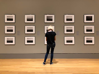
The first exhibit was a Japanese photographer and the entire gallery space was filled with images of the same subject, framed in exactly the same way, at the exact same size. Each photo was an image of the ocean and the sky. Different locations and different times of day, but everything else was the same. The entire gallery. Each photo was the same photo I take every single time I go to the beach. I love the ocean, the sky and that horizon line and I can look at it for hours. There's something meditative and compelling about it that exceeds the limitation of words. It puts me at ease. This exhibit did the same thing. Until I started thinking about it as composition and asking if it was art or if it was good art. Then I sat down and smiled more.
The next featured gallery contained several exhibits of the work of Katie Pell. This was clearly a 1970s themed exhibit and it was designed very well by the museum. There was even a spot with ogee print wallpaper and ugly chairs to sit and listen to vinyl records in the back. A nice touch. This is usually an alcove in the gallery used to encourage visitors to take selfies and post to social media. I liked this idea even better.
We entered the exhibit backwards as it was designed but it still worked well. The first gallery was pages from an artist book that Pell wrote and illustrated about her childhood in the 70s. I was born in 1972 and I felt an immediate connection with the images of being outside all day and playing in the woods and in a creek. Some of our students related as well even though their parents would be the same age as the artist.
Pell demonstrated her range of abilities with drawing, painting and sculpture. This giant charm bracelet was created using laminated plywood, a process my sculpture students are currently learning. Perfect timing.
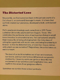
This was the statement for the body of work pictured below. I loved the line "the excitement of our pointless and forgettable lives".
The distorted faces from yearbook photos really grabbed my attention. I love to examine faces and bodies and how different they are from one another. Of course this is frowned upon in public, so being able to sit and really stare was nice. Each warped face contained within it it's own spectacular beauty.
The next gallery had large ornate frame drawings that reminded me of old album art. While the drawings were mostly just around the outside edge of the work, you could sit for hours and continue to find new things. There was so much personal symbolism and imagery repeated.
In a looping video the artist talked about everyone having a story to tell and the importance of how that story is told. Each person chooses how their story will be told and they edit the details and the narrative based on those choices. This is an echo of an idea that has been buzzing around in my head for months. it's so important to listen to someone as they speak. Not just to what they are saying, but how they are saying it. The way they tell their story will tell you exactly what is most important to them. Really listening to people is similar to really looking at them. Except listening may be more socially acceptable.
The main exhibit of Pell's work, a collection of manipulated album covers was probably my least favorite part of her exhibit. In this exhibit she used her own manipulation of existing album art to tell various stories about other people. Her work was more impactful when it was about her own story.
www.katiepell.com if you're interested in more.
Then it was upstairs to the permanent collection to finish up. Everyone had split up and I was alone. I wasn't super excited to see the upstairs work because I go to the museum at least once a year to see the rotating exhibits and the work upstairs always seems the same. There are minor changes but I typically move through very quickly with stops to see some of the favorites.
I love religious work. Believe whatever you wish, but there's something transcendent about some of the old Christian art. I've probably mentioned that before but for me there's an easy connection between spirituality and creating art. Whatever your particular flavor of belief, I think we could come to terms with some sort of agreement on this idea.
The Botticelli always gets a sit from me. The symbolism and iconography in Early Christian art is so fun. When I learned about the symbolism in Freshman year Art History survey, I felt like someone had exposed a book of secrets to me. All this meaning was there all the time but I never got it. There's so much more going on that just what is depicted. It's a secret club just for art kids.
As the work got more contemporary, I got more interested. This creepy "angel" kid was a good one. The hair looked real and the sculpture had a presence in this space. It's funny how moving from the older stuff into the newer stuff immediately started raising the question, "what makes this art?".
An Eames chair. It was nice to see a section dedicated to modern design and plastic furniture. Eames thought good design should be affordable and accessible to everyone. I like that idea. It's like public art for the home.
Same room, a Frank Gehry bend wood chair. I'm a fan.
Jean Arp's "Seuil Configuration". It looks like I made it. Had to think about this one for a while.
Georgia O'Keeffe
Chuck Close
Warhol with a wooden hand in front
The works on paper exhibit had a lot of big names. This one is Magritte.
...and Matisse
...and Picasso
And this is our group with Warhol's "Mao" series. Several of these people are new to me, meaning I haven't had them in class yet but they were all fun.
Outside the museum, Main Street was blocked off for the farmer's market. Just behind the vendors there were some artists quietly installing crochet art on the utility poles.
If you've never seen this, it's called "Yarn Bombing" and it happens is a lot of urban areas.
Maybe crochet isn't the correct term. Maybe it's knitting? I don't know. Either way it's really cool. I watched a police officer try really hard to watch one of these go up without officially seeing anything happen. He liked it.
As far as unauthorized public art goes, this type gets my seal of approval. It's temporary, beautiful, thought provoking and it doesn't damage or destroy anything.
After the art it was taco time. As art people, we didn't really consider that we were on the edge of "gameday" in a big football town. The taco place was pretty much on campus and we had to detour around all the stadium traffic and search for parking spaces. Still, we got our tacos.
Columbia isn't very far from my house but I'm usually just there when I'm passing through on my way to the coast. Since I was there and had a belly full of tacos, I decided to stop in town long enough to check on a sculpture I installed a couple of years ago. "Curtis & Bob" was still looking good.
Then it was back home to contemplate the trip. There was some good discussion with a couple of students about what we saw and what made it good. The museum had a little display asking visitors to categorize works from the collection as "art", "not sure" and "not art". That was certainly a good starting point.
I am always interested in observing others. I enjoy seeing other people interact with art. There were some people who took minutes to go through the entire museum. Then there were others who didn't even get to see everything before it was time to leave. I love to see people sitting down in front of works of art and I like to try to figure out what they are thinking. Watching the Art Historian look at art was like watching a master at work. Since I'm an artist, I know that I look at art pretty different than most people. Almost immediately I judge the quality of the work. As if I'm seeing if it's even worth my time. Then I begin to look at the technique. I want to see how it was done. I get close and I inspect the edges, the brush strokes and the craftsmanship. I critique it for composition and concept. But I also become a regular person at some point and it either fits my personal taste or it doesn't. This is when I throw all the other stuff out the window and just enjoy the work or hate it.
Is everything in a museum or gallery art? Nope. Is some of it good art and some bad art? Yep. Is there a difference between fine art and design? Yep. What about between fine art and craft? Yep. But the stuff by the big name people, that's definitely good art, right? Nope. Ok, but the stuff you like, that's gotta be good art, yes? Nope.
Go see some art and find out your answers to those questions. Or buy me a coffee and we'll talk it out.


No comments:
Post a Comment